이 글은 30 Days of Streamlit을 한글로 번역 및 쉽게 풀어쓴 내용입니다.
쉽게 말해 Streamlit Tutorial이라고 보시면 됩니다.
원본 링크는 다음과 같습니다.
환경
- Windows 10
- Python 3.10.11
- Streamlit 1.22.0
- 0. 시작하기에 앞서
- 1. 사이드바 추가 (st.sidebar)
- 1.1. Example 1
- 1.2. Example 2
- 2. 수치 정보 추가 (st.metric)
- 2.1. Example 1
- 2.2. Example 2
- 3. dataframe 보여주기 (st.dataframe)
- 3.1. Example 1
- 4. dataframe 스타일링
- 4.1. 원하는 행이나 열을 숨기고 보여주는 hide()
- 4.2. Cell에 색 입히기
- 4.3. Streamlit으로 스타일링 된 dataframe 출력해 보기
- 5. select box (st.selectbox)
- 5.1. Example 1
- 6. plotly 그래프 넣기 (st.plotly_chart)
- 6.1. Example 1
0. 시작하기에 앞서
- Day 4의 내용은 아래와 같이 Ken Jee라는 유튜버의 동영상으로 대체됩니다.(날먹...?)
- 동영상은 영어로 되어 있고, 길이가 무려 76분이나 되죠.
- 새로 배워야 하는 함수들도 많고, 코드의 길이도 깁니다.
- 그래서 Day 4의 경우에는 3개 글로 나눠서 작성하려 합니다.
① 동영상의 코드에서 나오는 새로운 기능들을 쉽게 정리하였습니다.
② 동영상의 코드를 정리합니다.
③ Github을 이용해 배포합니다.

1. 사이드바 추가 (st.sidebar)
- 백문이불여일견! 간단한 예제 몇 개를 통해 알아보겠습니다.
- 자세한 내용은 아래 docs 페이지를 참고하세요.
https://docs.streamlit.io/library/api-reference/layout/st.sidebar
1.1. Example 1
import streamlit as st
# Object notation
add_sidebar = st.sidebar.selectbox(
'Favorite food?',
('Apple', 'Banana', 'Pop corn')
)
if add_sidebar == 'Apple':
st.write('YOU CHOOSE APPLE!')
elif add_sidebar == 'Banana':
st.write('YOU CHOOSE BANANA!')
else:
st.write('YOU CHOOSE POP CORN!')- st.sidebar.selecbox() 함수는 selectbox 객체를 sidebar에 만들면서 add_sidebar에 선택된 값을 반환합니다.
- 그래서 if-else문을 이용해 반환된 값에 따라 다른 출력이 가능하게 합니다.
1.2. Example 2
import streamlit as st
# with notation
with st.sidebar:
add_ratio = st.radio(
'choose a language',
('English', 'Korean', 'Python')
)
if add_ratio == 'Python':
st.write('God Python!')
elif add_ratio == 'English':
st.write('English!')
else:
st.write('You choose K-Language!')- with를 사용해서 sidebar에 객체를 추가할 수도 있습니다.
- with notation을 사용하면 sidebar 내에서 출력물이 변경되는군요.
2. 수치 정보 추가 (st.metric)
- 중요한 정보를 눈에 확 들어오게 보여주는 함수입니다.
- 자세한 내용은 아래 docs 페이지를 참고하세요.
https://docs.streamlit.io/library/api-reference/data/st.metric
2.1. Example 1
import streamlit as st
st.metric(label='Temp_Seoul', value='20 ˚C', delta='1.2 ˚C')
st.metric(label='Temp_Busan', value='19 ˚C', delta='-0.8 ˚C')
st.metric(label='Temp_Daegu', value='25 ˚C', delta='3.4 ˚C', delta_color='inverse')
st.metric(label='Temp_Suwon', value='21 ˚C', delta='-1.5 ˚C', delta_color='normal')
st.metric(label='Temp_Ulsan', value='20 ˚C', delta='2.0 ˚C', delta_color='off')- Default로 delta가 양수면 위쪽 화살표(↑)와 함께 수치가 초록색으로 나타납니다.
- delta가 음수면 아래쪽 화살표(↓)와 함께 수치가 적색으로 나타납니다.
- delta_color는 옵션입니다. Default는 normal입니다.
→ inverse를 하면 normal일 때와 반대로 적용됩니다.
→ 예를 들어 Temp_Daegu는 delta가 양수지만 적색입니다.
→ off면 Temp_Ulsan처럼 회색으로 나타납니다.
2.2. Example 2
import streamlit as st
col1, col2, col3 = st.columns(3)
col1.metric('Temperature', '70 ˚F', '1.2 ˚F')
col2.metric('Wind', '9 mph', '-8%')
col3.metric('Humidity', '86%', '4%')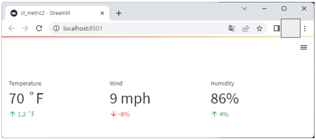
- st.metric은 st.columns과 같이 쓰는 경우가 많습니다.
3. dataframe 보여주기 (st.dataframe)
- 자세한 내용은 아래 docs 페이지를 참고하세요.
https://docs.streamlit.io/library/api-reference/data/st.dataframe
3.1. Example 1
import streamlit as st
import pandas as pd
columns = ['name', 'kor', 'eng', 'math']
data = [
['teemo', 100, 100, 100],
['jax', 90, 91, 92],
['jinx', 80, 81, 82],
['yasuo', 20, 21, 22]
]
df = pd.DataFrame(data, columns=columns)
st.dataframe(df)
- df가 그대로 보입니다.
4. dataframe 스타일링
- 혹시 dataframe이 스타일링이 가능하다는 사실 알고 계셨나요?
- DataFrame.style 속성은 Styler 객체를 반환하는데 이를 이용해 dataframe을 꾸밀 수 있습니다.
- 이를 이용하면 streamlit app에 dataframe을 우리가 원하는 대로, 꾸며서 보여줄 수 있습니다.
- docs에는 방대한 내용이 있고, web-frontend 기술을 알아야 하는 사항도 있지만, Ken Jee의 동영상에 나오는 수준까지만 알아보도록 하겠습니다.
- 자세한 내용은 아래 docs 페이지를 참고하세요.
https://pandas.pydata.org/docs/user_guide/style.html
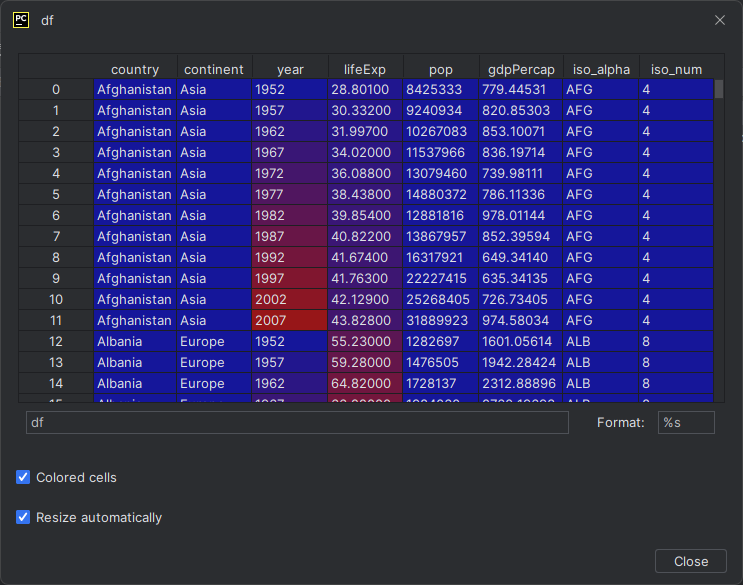
4.1. 원하는 행이나 열을 숨기고 보여주는 hide()
- 아래 이미지를 클릭해서 크게 보세요!

4.2. Cell에 색 입히기
- 아래 이미지를 클릭해서 크게 보세요!

4.3. Streamlit으로 스타일링 된 dataframe 출력해 보기
- 스타일링 된 dataframe을 streamlit으로 출력해 보겠습니다.
import streamlit as st
import pandas as pd
def style_func(v):
try:
if v == 100:
return 'color: red; background-color: black;'
elif v >= 90:
return 'color: green;'
elif v >= 80:
return 'color: blue;'
else:
return 'color: magenta;'
except:
pass
columns = ['name', 'kor', 'eng', 'math']
data = [
['teemo', 100, 100, 100],
['jax', 90, 91, 92],
['jinx', 80, 81, 82],
['yasuo', 20, 21, 22]
]
df = pd.DataFrame(data, columns=columns)
df_style = df.style.applymap(style_func)
st.dataframe(df_style)
5. select box (st.selectbox)
- 1번의 사이드바 부분에서 나왔던 함수입니다.(그때는 st.sidebar.selectbox였죠. 똑같습니다!)
- 자세한 내용은 아래 docs 페이지를 참고하세요.
https://docs.streamlit.io/library/api-reference/widgets/st.selectbox
5.1. Example 1
import streamlit as st
option = st.selectbox(
'Favorite Food?',
('Apple', 'Banana', 'Pop Corn')
)
if option == 'Apple':
st.write('You choose APPLE!')
elif option == 'Banana':
st.write('You choose BANANA!')
else:
st.write('Always POP CORN when movie!')
6. plotly 그래프 넣기 (st.plotly_chart)
- plotly는 Python에서 차트를 그려주는 대표적인 라이브러리입니다.
- streamlit에서는 plotly로 그린 차트를 Display 하는 함수가 있습니다.
- plotly 튜토리얼이 아닌 streamlit 튜토리얼이므로, plotly 사용법은 생략하도록 하겠습니다.
- 자세한 내용은 아래 docs를 확인해 주세요.
https://docs.streamlit.io/library/api-reference/charts/st.plotly_chart
6.1. Example 1
import plotly.express as px
import streamlit as st
df = px.data.gapminder()
fig = px.scatter(
df.query("year==2007"),
x="gdpPercap",
y="lifeExp",
size="pop",
color="continent",
hover_name="country",
log_x=True,
size_max=60,
)
tab1, tab2 = st.tabs(["Streamlit theme (default)", "Plotly native theme"])
with tab1:
# Use the Streamlit theme.
# This is the default. So you can also omit the theme argument.
st.plotly_chart(fig, theme="streamlit", use_container_width=True)
with tab2:
# Use the native Plotly theme.
st.plotly_chart(fig, theme=None, use_container_width=True)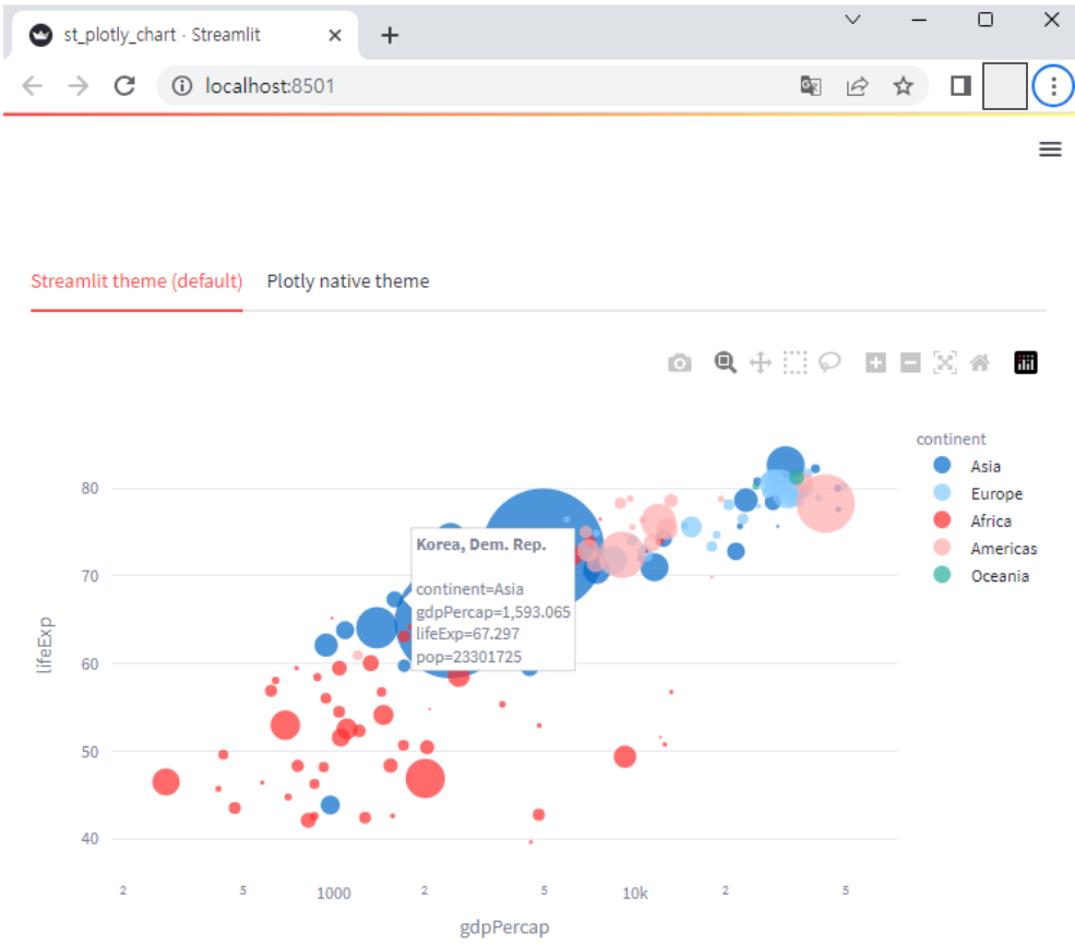
- plotly에 차트 객체(fig)에 대해 간단히 설명드리면,
→ 사용한 데이터는 plotly.express 라이브러리에서 기본으로 제공하는 gapminder()라는 데이터이고, 이를 df에 저장
→ df의 데이터 중 year == 2007 인 데이터만 그래프화
→ x축은 gdpPercap, y축은 lifeExp
→ continent 별로 색 구분
→ 마우스 hover 시, country 보이도록 설정
- st.plotly_chart() 함수를 이용해, plotly 차트 객체인 fig를 streamlit app에서 display 했다는 걸 확인할 수 있습니다.
'프로그래밍 > Python' 카테고리의 다른 글
| [30 Days of Streamlit] Day3. 버튼 위젯 사용법 (0) | 2023.06.10 |
|---|---|
| [30 Days of Streamlit] Day2. 첫 Streamlit App 실행 (0) | 2023.06.06 |
| [30 Days of Streamlit] Day1. 환경 설정 (0) | 2023.06.06 |
| [Python] 자주 사용하는 String Format 정리[feat. locals()] (0) | 2023.05.19 |
| [Python] 컬럼 type이 list인 DataFrame에서 subset 구하기 (0) | 2023.05.17 |


댓글